A unique and working logo? Easy by following the basic rules.
Designing a Unique Logo: Design Tips
Aspiring designers face a problem when the logo they have created does not work. This happens for various reasons, which will be discussed below.
Experts recommend starting a logo design with a conversation with a client. This will help to better understand the direction of his business and target audience. During the discussion, it is necessary to ask the client questions that will help to better understand what type of logo to create, so that it carries maximum information about the specifics and the brand.
After the conversation, you need to create a sketch of the logo and show it to the customer. You don’t need to make a complete logo. You can create a sketch of a sketch in a graphic editor or in pencil on paper at the very moment when the designer is visited by an idea. Although these sketches will be imperfect, they will carry basic information. Such sketches must be provided to the customer so that he can determine which of them is the most successful in his opinion.

Colors
It is also important to choose the right color palette. Here you need to remember that it is the color that attracts the attention of a potential buyer in the first place. When choosing colors, you need to pay attention to the following points:
- Use color matching computer programs to determine as accurately as possible which of them can go well with each other.
- All elements must contrast with each other.
- When using only black and white, the oversaturation effect should be avoided.
If you adhere to these rules, you can choose a color that will not cause a negative reaction from both the customer and the buyer. Therefore, it is recommended to offer the client several options for coloring the logo at once.
Proportions
When creating a sign, you need to adhere to the rules of proportion. The drawing should ultimately come out simple at first glance, but at the same time have the correct geometric shapes. The thing is that such an image will be better perceived at the subconscious level and will not cause negative reactions.
Space
Also, the designer needs to take into account that the logo should attract attention on different backgrounds, and therefore it is necessary to effectively use the space in the picture around the image itself and the text. Such a sign will become conceptual and will attract the attention of users who will pay attention to it and stop for a minute to carefully consider it.
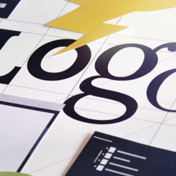
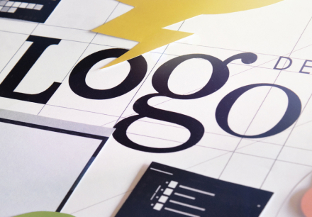
Fonts
Most designers use a standard set of fonts on logos that are combined with the image. As you can see in practice, nothing will come of such a picture, because other companies also use the same fonts, which makes them non-unique.
If the font repeats the font of a well-known brand on the logo, then this can bring other problems. Similar fonts are only recommended when making a parody of a brand. But for more important orders, it is recommended not to use them.
Also, no need to copy logos or make clichés from them. This can spoil the already created logo. It is worth abandoning the use of elements on the logos of famous brands.
You don’t always need to use a lot of detail in an image. Brands can be remembered as successful examples of such logos:
- Nike.
- Puma.
- Apple and others.
Emotions
Every logo should appeal to emotion. These techniques can be a lifesaver for companies that manufacture products that can cause resentment in some sectors of society, such as alcohol or tobacco. In this case, it is recommended to use humor when creating a logo so that the picture evokes positive emotions.
Based on the above, we can conclude that applying these recommendations in practice, everyone will be able to create a logo for which they will not be ashamed in front of the customer or colleagues. It is also important to maintain your style and be creative in all matters.